Art

I think I got my love of art from my grandmother. She was a beautiful artist and I can remember days spent in her garden with a paint set trying to paint the world around us. Capturing the right shade of green for the trees and the way the sunlight would bounce through the woods. My parents even got me art lessons during a time I now know they really couldn’t afford. Sadly my need to be the best and never getting it quite right won out in the end. I’ve since grown out of that need to be perfect and get it done perfectly, but it did not come without massive amounts of praying and hard work. Fast forward to today and my love for art remains. Over the years I’ve been slowly growing our collection of art. Mostly from southern artists minus the family pieces that are from the north. So today I thought I would share some of my favorite pieces as they stand today.

IMG_0847.JPG
IMG_0848.JPG

This piece is my newest acquisition. It is by Emily Morgan Brown and a piece that will be passed down to Ellie one day. Emily’s process is one she learned from using ancient techniques. She takes the dried flower, grinds it down into a pigment which creates an egg tempura. This process is then used to paint on the linen. The detail is exquisite and one I always find myself staring closely at. When deciding what I wanted for this space Emily encouraged me to do find something that had meaning. For us the dogwood fit that bill. It is the state tree for Virginia which is my grandmothers name and who Ellie was named after. Also it has been told that the cross may have been made out of the dogwood. Of course we can’t know that for sure, but either way it reminds me of the beauty in which Christ is. I had a custom piece of acrylic cut locally and put on stand-off’s to protect the linen from accidental splashes.

IMG_0843.JPG

Mckenzie Dove is another local artist who uses color that feels from nature yet her pieces are more modern in feel. The juxtaposition really speaks to me. New and old working together. It is pretty much how I designed our whole home.

IMG_0835.JPG

The piece above was done by a dear family friend. She is a master at adding depth to her pieces. She is a grandmother who paints simply because it makes her happy. In return this piece makes me happy every time I look at it. It is one that I treasure dearly.

Below are two pieces that I got from Addie Chapin for a steal. She was having a instagram led studio sale and these two made their way into my home. She utilizes nontraditional media to create uncommon expressions of color, composition, and texture {her website said it best}. The pieces are dimensional and have layer upon layer adding to the textural feel.

IMG_0838.JPG
IMG_0829.JPG

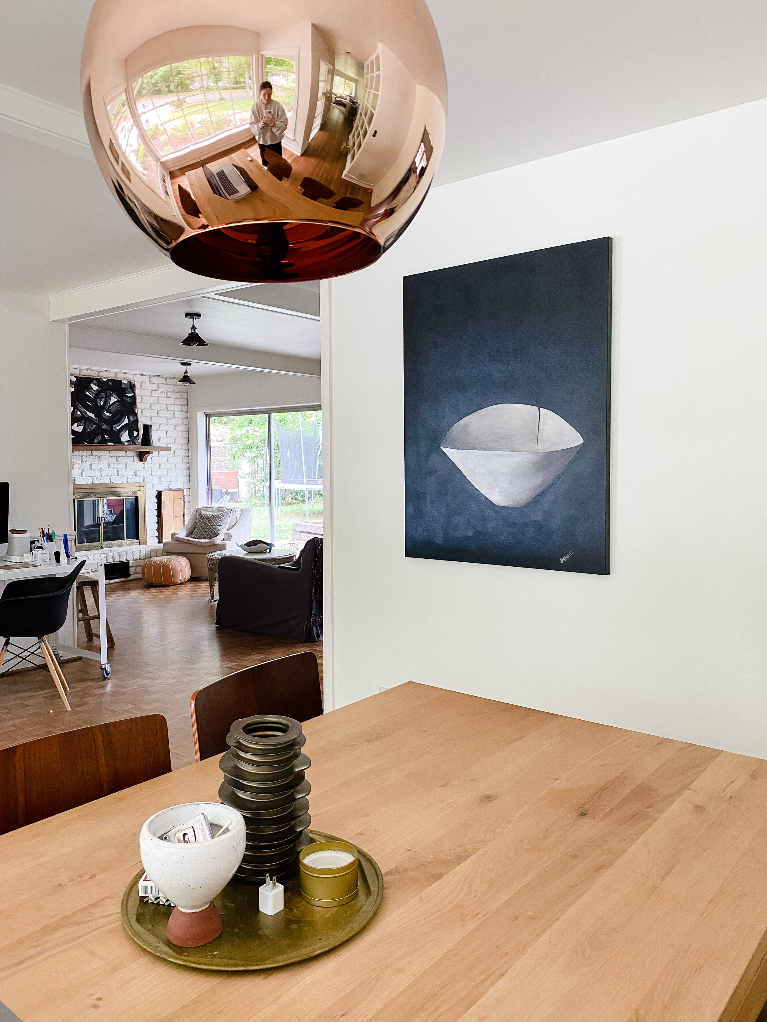
The piece on the bookshelf above is by local artist Cecily Lowe. I have quite a few of her pieces and am always tempted to get more every time she releases a new series. The movement and layering of color I find soothing and they can easily hold their own when among a rather busy vignette.

Beyond this piece, on the wall, you get a peek at a piece I did years ago, before we could afford to invest in art. This one has stuck with us in many moves and although it is not the finest it still reminds me of when the kids were small and I was trying my very best to create a well designed home on a shoe string budget. It was a sweet time in our lives and one I simply don’t want to forget. So it still hangs as a reminder of yesterday.

The photograph is one we took during a trip to New York when the kids were small. We had it blown up to a 60x48 and it helps draw your eye into the space. Seeing the street beyond only enhances the depth of our own space. We needed something in a large scale to help balance out the windows that dominate the room. Making the image black and white allows the greenery from outside to take center stage without making it feel busy. Our spaces lean towards a classic minimal feel.

IMG_0833.JPG

The utility spaces such as bathrooms and our laundry closet were areas that I wanted to be sure to inject some special pieces. The spaces themselves are rather simple and I knew the art would make for a good focal point and maybe even distract me a bit while cleaning and laundering.

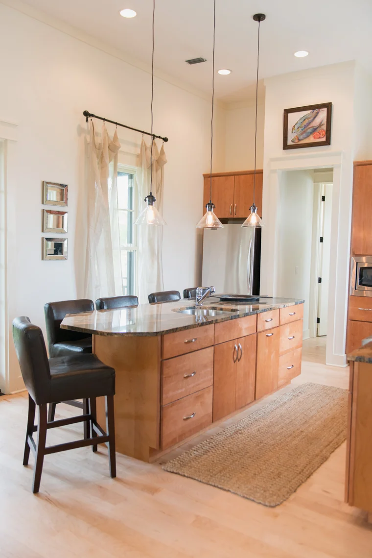
This is the powder bath. We did simple updates to this space such as paint and changing out the countertops, mirror & lighting. This space can be seen from the kitchen area even though it is in the hall beyond. I am always on everyones case to keep the lid closed and finally the family does it to keep me quiet I am sure. We thought about rearranging the doorways, but it wouldn’t make sense in the end so here it stands. This little shelf area was here when we moved in and I never quite got it the way I like it until now. I used old items from around the house and added the footed stand more recently for toilet paper. It may be a bit odd, but with the amount of hosting we do we really need it in arms reach. Function will always trump in this household and I just try my best to make it look good. The art piece is by another local artist, Amy Stone. I love the way the tones all work together as a whole.

IMG_0806 copy.JPG
IMG_0815.JPG

The piece above lives in our laundry closet. We moved the laundry room out of the main kitchen area a little over a year ago. It really is my happy place as the hall {shown in the photo below} is open to a wall of windows that gives off great light. Often enough the doors are left open so I knew a piece of art would pop off the wallpaper. I added another McKenzie Dove piece as I knew it could hold its own and play nice with the dark vibe I have in here.

The piece in the kids bath is by Michelle Armas. She is in Georgia and we “met” blogging years ago. We have kept up on instagram and I knew I wanted a piece of hers to live in our home. Her pieces use more vibrant which I knew the kids would love and what this bathroom needed. One day, once funds allow, I plan on designing this bath around that very piece of art. For now it makes the space happy.

IMG_0822.JPG
IMG_0814.JPG
IMG_0818.JPG

This is the hall I mentioned above, that houses the laundry closet. It is to the right of me. When we first moved in we painted the wall black to help distract from worn cork floors that used to dominate this space. Since then we added hardwoods, but we have yet to tire of the black. On the black wall is one of my favorite photos from our road trip down the west coast a few years ago. It was just an iphone photo showing that every piece does not have to cost a ton. Down the hall I have two more Cecily Lowe pieces that help draw the eye further down the hall.

To the right, is a piece by my grandmother. I can see it from the master bedroom bed when the door is open. I love the way the colors play off the outside beyond. It is one of the few pieces I would grab if the house was on fire. So grateful my mother passed this piece down to me.

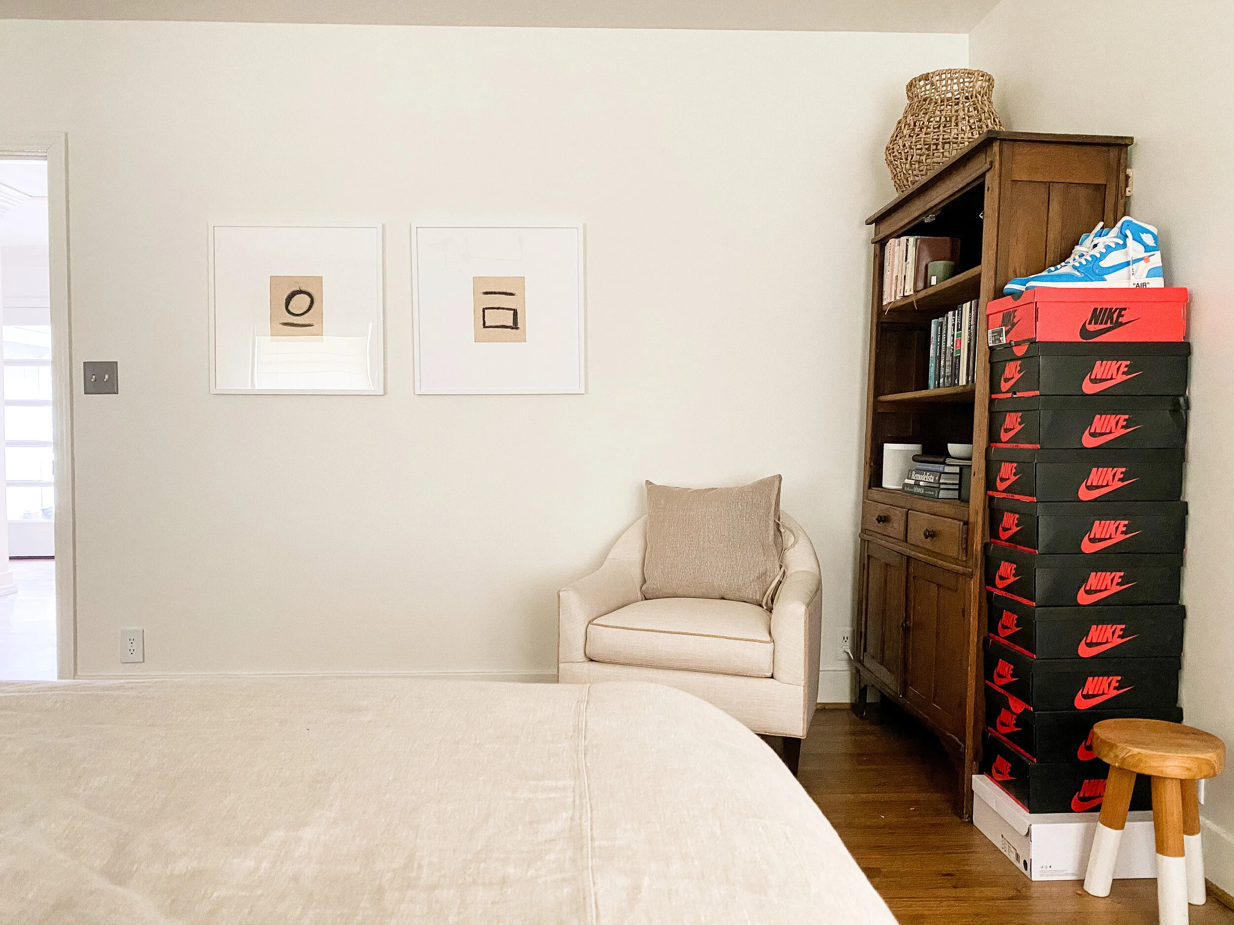
Below in the master bedroom, I wanted something simple as this space is kept minimal and clean. I did the uncomplicated shapes on handmade paper that my papa brought back from Colombia when he visited his home country years ago. Adding the modern bold lines on top of such a old world textural paper continues my love of new and old. I tended them to be place holders till I found the perfect pieces, but these have grown on me so much I am not in a hurry to change them out anytime soon.

IMG_0827.JPG

Two Worlds Collide

Over the summer I completed a project that focused on bringing a newlywed couple's design styles together. He is very masculine, loves duck hunting, deep colors and wants functionality over anything. She is very feminine, loves all things to be light and airy, and just wanted their first home together to feel finished. They both have each other and their love for art and travel in common. Design wise that pretty much is all they had in common. My job was to pull both their styles together without favoring either side. To find a balance they both can live with till they find their permanent {larger} residence in a few years. They currently are renting a 2 bedroom condo in a great location. That means a lot of the finishes we could not change, but had to make them work on budget.

TWOELLIE.KJP 1000 of 44.jpg

The sunroom/breakfast room was easy. He already owned the chairs and I simply recovered them in a simple linen. The table and rug was borrowed from the rental which came partly furnished. She had this suzani and I had it framed to make a huge statement. This room I would say airs more on her side of design.

TWOELLIE.KJP 1005 of 44.jpg

The kitchen was white on white on white. It could have been worse, but they both like color. I used an outdoor blue and white runner on the floor and simply added a collection of antique plates she owned and added a few accessories just for a touch of interest without going overboard. The runner is great for kitchens. It can just be hosed off!!!

TWOELLIE.KJP 1006 of 44.jpg

The table, chairs, lighting, and mirror all came with the rental. I found this to be ample opportunity to display some of their growing art collection. I hung the pieces on the mirror with 3-M hooks. It made a room they once hated into a room they can easily enjoy.

TWOELLIE.KJP 1010 of 44.jpg

The bar was easy to fill with both his and hers glass collections. I just made it look good.

TWOELLIE.KJP 1012 of 44.jpg

The living room is a mix of new and what they already had. I came in with new chairs, sofa, pillows, jug lamps, and ottoman. Everything else is their's. I am hoping once they are in the market for a new rug then something like this would be chosen. It would really lighten up this room some more and make it really shine! She really likes florals so I choose pillows with a deep brown more graphic floral to make them slightly more masculine to suite them both.

TWOELLIE.KJP 1025 of 44.jpg
TWOELLIE.KJP 1014 of 44.jpg

The table and chairs came with the rental and she had this great bookcase. We decided to make it a sort of library and another place for him to study during his residency. Again I used the accessories that they had and was able to pick this floor lamp for someone to buy them as a wedding gift. There is no overhead lighting in this area. They love the more Spanish style and travel often and of course come home with goods every time.

TWOELLIE.KJP 1021 of 44.jpg

They owned everything here too. They needed a spot to drop keys and such when they came in. It's a sort of make shift entry where there wasn't a defined space. The baskets provide great storage which was much needed.

TWOELLIE.KJP 1020 of 44.jpg

The 1/2 bath is small and all white. It fell flat with the not so great finishes. I added texture through accessories and the antique mirror was layered to add interest and depth. Yes, it could be hung lower, but alas that thing is heavy.

TWOELLIE.Screen shot 2013-10-29 at 9.06.45 AM.png

You may have seen this space before when I featured a completely budget friendly art wall. This is the guest/office space. The other side of this room houses a desk and such. This is her old daybed and he wanted the space to house the fun ALABAMA pillow. The rest I added to make it all work together.

TWOELLIE.KJP 1028 of 44.jpg

In the guest bath I tried to carry the warmth from the bedroom into here and also added some more bird prints over the commode.

TWOELLIE.KJP 1030 of 44 copy.jpg

The master they both wanted to be a soothing space. Although the bedding is a neutral it had a great pattern/texture that kept it from falling flat. The headboard he had and I recovered it in a neutral linen. The frames I hung to house wedding pictures in which they would hang everywhere if they could. Not such a bad thing since we were their photographers too. HA. These are photoshopped in, but you can get the idea.

TWOELLIE.10.29.13.jpg

While Ellie was at horse camp this little man was my partner in crime. He spent days unwrapping everything, installing, and cleaning up after my mess. He also had a keen eye for when I did something he did not like or placement of objects.

I would say overall this was a study on home styling. The big living room pieces were new, but the rest was just adding the fluff and making what they already owned cohesive. Although it is fun to start all new on occasion most of the time budget doesn't allow that and a good fluffing is all it needs. The perk of this home was that I got to move them in and place every object where I thought fit for space and flow. They had no preconceived ideas and were at a lose on how to make their stuff work together so that's where I came in.

A Beach Cottage {done by me}

I seemed to have fallen off the blogging bandwagon... again. Ha. I try to be better, I really do. Here is that post I promised from a couple of weeks ago. This beach cottage went through quite a transformation. It's not 100% finished in these photos, but almost. We were waiting on a few things to come in and I am hoping they had! There are some new pieces in this home, but a lot of it was just reworked into the space. Most of the paintings are new and were commissioned pieces. Too fun to say the least. To see some before's you can go here. It doesn't even look like the same home! YES, I realize there are way too many photos but this is a big house and who doesn't like a good stalking? On to the tour...

TWOELLIE.BEACHCOOTAGE.16.jpg
TWOELLIE.BEACHCOOTAGE.13.jpg
TWOELLIE.BEACHCOOTAGE.14.jpg
TWOELLIE.BEACHCOOTAGE.15.jpg

This is the main floor. It has a den that goes out to the private courtyard with pool. It has a bath that attaches to an outside shower, a bunk room, and another bedroom that I did not share because it was not 100% ready.

TWOELLIE.BEACHCOOTAGE.12.jpg
TWOELLIE.BEACHCOOTAGE.11.jpg

Each of the 3 floors has a landing spot that were never utilized. I decided to make this one into a cozy nook for reading.

TWOELLIE.BEACHCOOTAGE.8.jpg
TWOELLIE.BEACHCOOTAGE.6.jpg
TWOELLIE.BEACHCOOTAGE.7.jpg
TWOELLIE.BEACHCOOTAGE.9.jpg
TWOELLIE.BEACHCOOTAGE.10.jpg

This is on the second floor with beautiful views of the beach and porches on three sides. All the lighting is new. Before it aired on the contemporary side which did not fit the homeowners at all. The mantle did have a glass and metal rod mantel thing and we had a slipcover of sorts built around it. At this time we were waiting for new cabinet hardware which I believe has been installed since. We did plan on painting the cabinets, but decided to hold off till after the busy summer season and to be honest I no longer hate them with the new decor plus it saves the homeowners tons of money.

TWOELLIE.BEACHCOOTAGE.5.jpg

This is the third floor landing and it is a bit smaller than the latter. We just made it look pretty with things I found around the house.

TWOELLIE.BEACHCOOTAGE.3.jpg
TWOELLIE.BEACHCOOTAGE.2.jpg
TWOELLIE.BEACHCOOTAGE.1.jpg

The master and a guest room occupy the third floor. In the master I simply reworked items from around the house and added a few new pieces of art. The guest room got toned down a bit.

TWOELLIE.BEACHCOOTAGE.4.jpg

This may be one of my favorite yet simplest additions. The homeowner actually had this vision and had her created for this space. I will take full credit of going a top a very high ladder and hanging her though. Ha. Oh, and did I mention it's up for sale and rent?